4 Best Practice For Creating A Beautiful Minimalistic Design For Your App
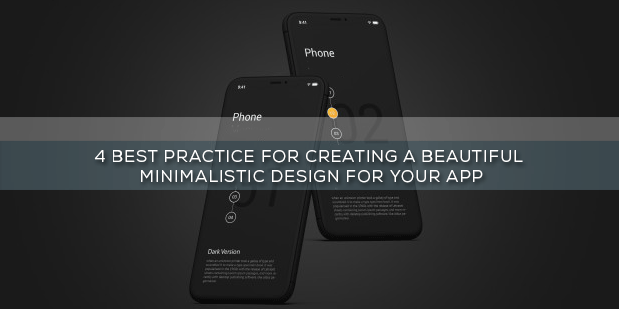
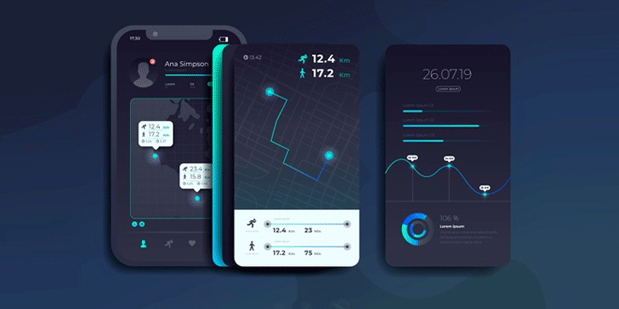
While the mobile devices are increasing at an exponential rate, the minimalism in app design is getting more prominence. Minimalism in app or website brings an additional benefit in terms of faster loading and higher compatibility within screen sizes. A well designed, beautiful minimalist app combined with impressive usability quotient and easy navigation is a powerful mean of communication.
But minimalism is not as simple as it sounds. If you want to create a minimalistic app design, then make sure to follow some basic thumb rule from the beginning.
- Removing all extra elements
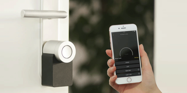
Best iphone app developers suggest that minimalist design does not give room for any loose ends. Every item within the app should definitely have a purpose. In this design, all other elements are eliminated except the one which are highly essential.
- Don’t use stock images and use image only when it simplifies the message conveyed.
- The copy of your website should hold only the information which can convey the message thoroughly. The text message should contain all meaningful information as any reduction in these information can make the app meaningless and confusing.
- Give focus on single focal point per screen
Less is the element in the screen, more will be the focus on other elements. The idea of minimalism works around the idea of designing around content. This design form does not only stress on elimination but also giving focus on content. Therefore, when it comes to minimalism design app, it should be highlighting the content and a clear CTA.
- Use simple colour scheme
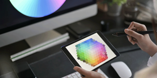
Using simple colour scheme improves the user experience while using too many colour can actually create a negative impact. Experts from android app design agencies suggest that using less colour does not mean necessarily designing the app in black and white. This means using colour which can appropriately portray the design of the app.
You can consider using bold colour for the design. Generally larger fonts and accent colour are highly efficient in drawing the user attention without using any hint.
- Right use of whitespace
Whitespace is the space which is given around any element. This holds a very dominant role in minimalism design as negative space make minimalism look visually comprehensive and highly readable. You can always consider whitespace as frame and border for your content rather understanding it like empty space.
Generally larger distances create forced attention. For bringing adequate notices to your app content, make sure to increase the negative space around it. However, make sure the empty spaces leads to logical pattern within the content.
Conclusion
Minimalism is just the ideal way to gain attention of the users in your app especially when the competition is too strong.
If you want to achieve simplicity and frictionless design in your app then minimalism is just the right thing for you. Combine usability with functionality and refinement to get best of the result. It is also important to remember that minimalism is not about elimination only, it is also about adding element which speaks for your app.
