6 Tips To Design An Exceptionally Good Mobile App Notification
You are in the mid of a serious work and suddenly your mobile gives you a beep!
Not again! It’s the notification again.
Well, believe it or not but most of the people have similar expression or even worse of it when they find notification in their mobile phones. These notifications are never read or even opened for that matter. Designed to enhance the user experience, these notification seems to work the opposite. It irritated the users and finally leads to app installation.
The original purpose of notification is not about irritating someone. It has loosed its focus to deliver useful information. People tend to extremely ignore notification because it does not provide value of interruption. An app is installed by users to gain some kind of benefit even managing the notification issue unless it is meaningful. Most of the time the deviation begins from here itself, designers never bother to design a notification and significantly harm the user experience for the app.
Notification should be designed in a way that connect the users with the brand. But the real catch is crafting notification that does not make its place in bad UX design and are meaningful as well.
This post is dedicated to find tips for designing a notification that brings the best of the brand to users and grab their attention.
Let just dive in:
- Need
Developer from Android UX design services insist that before beginning with the notification procedure, it is important to understand the need for it. Top developers believe that most of the notifications are simple burden providing no added advantage to the users. If the notification provide information about a action that does not require system for recovery, then that notification is useless. At times when there are big errors are the system is dependent on the user’s action, notification is of great help for app makers as well for users.
- Tailor-made
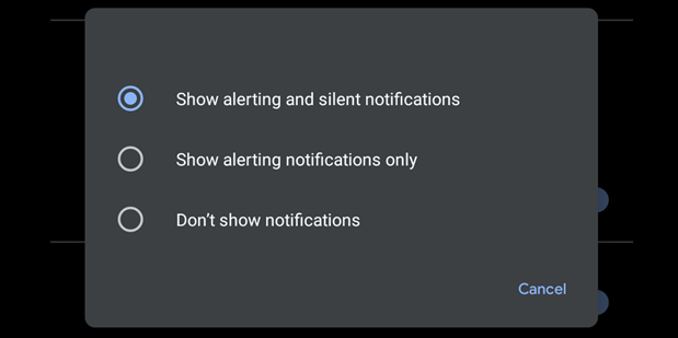
Notification should be customizable for product features. This will help users select the kind of content they need for notification. If the users will be given the ability to select their alerts, they will happily see the pings coming on their mobile phones. In case, app maker don’t own sufficient user data, customization can be a great help.
- Appropriate and timely
Experts from iphone app development company in jaipur, suggest that to increase the worth of notifications,app makers should switch to user data analysis stats. At the time of making, it is important to pay attention to the product usage stats and other information relevant to targeted audience. This way the notification will hold value for users and increases the conversion as well.
- Clarity in the content
The content of notification should definitely correspondent with the language used by users for content. The content made for notification should be clear and easily understandable. The content should not sound spam or irritating. App developers should stick with the brand image while crafting the content unique and different for the notification.
- No interference
Notifications are meant to help users rather interfering in their daily action. A timely content rich notification can help users but there are many different kinds of notification that pops up everyday. Designers will have to make sure to design their notification in a way that users can distinguish the valuable notification and discard the rest.
A valuable notification will inform the users with valid information without doing much interference. Use small pinpoint notification to inform people yet not disturb them.
- Last chance prompts
Nothing can be more troublesome than deleting an app that stores all your valuable data by mistake. Be it social media or cloud based data storage app, deleting the app mistakenly is a big trouble in itself.
Last chance prompt notification are therefore an essential way to keep you away from such troubles. These dialog box contain confirmation signal that users will have to provide before deleting the app completely. Designer should create big popup box to gather the attention of the user. Ask concise question in order to take prompt action by users.
- Control the number
After designing a valuable notification design, what converts all the efforts into waste is frequency. Notification dose can kill the communication that established over the period of time. It is important to understand the users,their requirements, patterns and then decide on the frequency of the notifications send.
Conclusion
Most of the time designers don’t put valuable emphasis on designing the notifications, as a result most of the app notifications are remains unheard. It is important to study the trend of the users preference and develop the design of the notification which is user friendly and help brand communicate better with the users.
