10 Mobile App Landing Page Examples with Tips

App Store and Playstore have more than 2 million apps (each) and thus the probability to find a substitute for your app is high. This calls for your app to have an X factor or inviting “landing page”. The landing page acts as a direct promoter of your business application after Universal App Campaigns, PPC Campaigns, and Social Media Campaigns.
You can certainly fetch quality traffic to your app through various online ad campaigns but what is the point if those do not convert. Mobile App Landing page creates the first impression of your application and therefore it has to be clean, sorted, responsive, and appealing.
In short, a stellar application supported by an amazing landing page is the best way to fetch attention. Marketing is important to pull potential clients but conversions have to be the ultimate goal. The article has some of the best landing page examples with important elements and tips to give you a head start with your future business app development. You can use the knowledge to communicate your preferences with the mobile app development company.
Good news for online businesses here is 50 positive mobile app stats showing growth and success – a must-read.
More About Mobile App Landing Page
A landing page is the very first impression of your mobile application. No matter how high the demand for your products/services is, if the first impression is wrong then your target audience would not want to explore your app further.
Also, the landing page is the direct promoter of your application and therefore should give a clear idea of what your app does? The problems it solves, the key features, and its value proposition. Landing page being the entry point of the user’s journey with your brand, ensure everything starts on a good note.
By far it is clear that you cannot go easy with your mobile app landing page designs. Also, the landing pages should be responsive enough to adapt to the configurations of compact devices the viewer is using.
Must-Have Elements of an Effective Mobile App Landing Page
Most of the landing pages are a disaster because the viewer is confused about what the app relates to and how it is to be used? There are even studies to clarify that most of the app bounce rates are because the customers have trouble surfing the application (no information is delivered through the landing page).
If you are investing in an app, then the bounce rates will hurt you the most. Here are some key elements you need to integrate into your app landing page/home page (without fail) to reduce bounce rates.
1. Call To Action
2. Relevant Headers and Footers
3. Attractive and Relevant Media
4. Tutorials
5. Main Body Copy
6. Acceptability Proof
Call To Action
One of the reasons why you need a landing page is to tell your customers their next move. Tell your reader their call-to-action (CTA) like downloading the app, signing up for a subscription, building a profile, requesting a quote, etc. Remember that CTA is what supports your app’s ultimate goal. CTA is to give the direction to your customer and if that is missing then your clients will easily go through the information and exit the app without knowing the upcoming process. Know more about CTA and how you can use it in your favor to get more clicks and conversions.
Relevant Headers and Footers
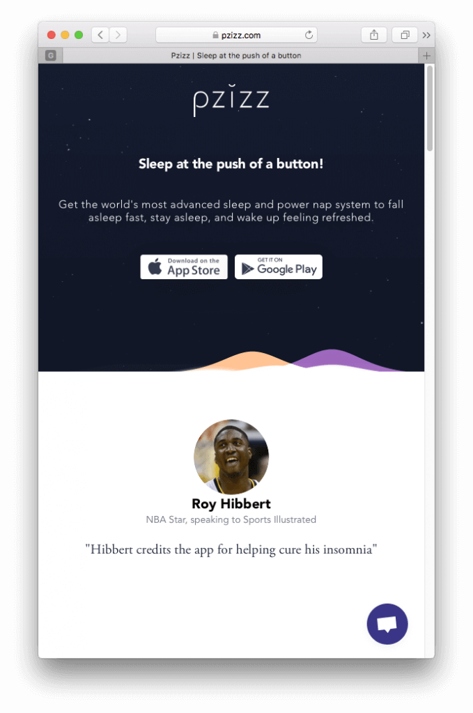
What comes after CTA is the heading. Most of your app viewers will read the heading and presume what services or products you are selling. Out of 100, 50% of the viewers are likely to get impressed by the headlines and go to CTA buttons for further processing. Go for to-the-point and relevant headlines with the use of keywords. Or at least make them appealing enough to spark curiosity so that the viewer reads the content beneath the heading. Also, fonts and colors play a major role in fetching eyeballs. Just like Pzizz, the sleeping app depicts its purpose with its main headline, and beneath gives the CTA for viewers to click the button then and there. Also, a white color font over a navy blue starry surface is innovative and clear.
(source: clevertap)
Attractive and Relevant Media
No landing page looks impressive without the attractive and meaningful media integration. Make sure you are not going off-topic in order to make the media look attractive. Apart from headers, the media gives an idea of what your app is all about. The media should reflect what you said in the main body of your app. You can use media to reveal the benefits your app gives. Key elements are not enough to increase the clicks on the app, one must make the app responsive by knowing which type of app is best suited for their business. Know more about types of mobile apps with their pros and cons. OR hire the best mobile app developer for your business app solutions.
Tutorials
If your business app structure is complex, has a lot of elements, or involves a hard sign-up process then the apt tutorial is your savior. You can highlight the purpose, benefits, and importance of the app through headers, main body, or media but what makes them confident in your services and the CTA is the guiding video or a user manual. A tutorial fixed to a mobile app landing page is more of a necessity than a luxury for a complex website.
The Main Body Copy
The main body copy is here to give value to your business app by giving as much information as possible and answering every unspoken query of the potential clients. Before you frame this segment, make a list of general queries that can come to the minds of the viewers and answer them then and there.
The length and tone of the body copy entirely depend on your industry type.
While a casual gymming app will have more videos, images, and casual but impressive content tone, an IT Firm will focus on more written content with highlights, videos, and impressive but technical content tone.
Acceptability Proof
This is the segment where you show the authenticity of your application by setting examples of previous user’s experiences. This can be through testimonials, reviews, star ratings or comments. Show the number of downloads in days, to prove the authenticity of your application.
Not limited to body copy or media, you can use client’s testimonials to highlight the benefits of your application – which feature or functionality they liked the most.
Bonus – 8 Steps to Understand Mobile App Development Cycle
10 Successful Landing Page Examples and Tips They Convey
One must always learn from the best examples. Here are some tips fetched from the best examples of successful app landing page designs.
1. Crossy Road
Application Purpose – A Gaming Application for Android, iOS, iPad, and Windows.
The app has its CTA buttons on the top to target the clicks. Even if someone is well-versed with their gaming app then they will skip the additional information to sneak to the main process – downloading the app. If you are aiming for a gaming application, ensure that you keep your texts as short and engaging as possible. The person who lands on a gaming app is seeking action rather than words.
Crossy Roads has the cleanest and the simplest landing page design with a few in-app screenshots, direct download links, and some previously gathered tokens of appreciation.
Tip: A Clean landing page with short, engaging, to-the-point, and user-friendly content.
2. BigOven
Application Purpose: A Recipe Aggregator
As it is a recipe app, BigOven has more written content with HD images and videos. Every word is readable with proper font sizes and colors, correct background, and carefully integrated images and videos – in the fashion that the visual content does not overlap the words. As per the best UX policies, fonts should be seen clearly and read from an arm’s length.
BigOven is an exemplar of perfect font practices as the header texts roar to make the points clear in the minds of the viewers. The header text makes the purpose crystal clear, eliminating the need for you to read the body content.
Tip: Font Readability and careful image/video integration.
3. HotelTonight
Application Purpose: Hotel Aggregator
As you will see the landing page design and content of HotelTonight you will immediately come to know why you need to download the app. HotelTonight’s landing page depicts the value of the app as an effort to increase the impressions and conversions from the app.
The app has a simple sign-up process (integrated to the landing page itself) following which you can start with the process immediately. The app uses simple and to the point language to keep clients engaged.
Tip: Tell views what to expect and why to download the app.
Mobile app development is not the task of a day or two. The process starts with an idea which is then turned to reality by expert app developers. Even before you outsource the tasks, here are 10 steps you must take before starting Mobile App Development to ensure that your investments are in the right direction.
4. Standard Notes
Application Purpose: Storing and securing important notes
The landing page design of Standard Notes flaunts an entirely white background with every focus driven to the CTA buttons that are blue in color. You can easily fetch attention and clicks by highlighting your app’s CTA buttons. Reach out to the best possible conclusion by prior experimenting with colors, size, fonts, and placement of the CTA text and tabs.
Though standard notes is a multi-OS app, the same CTA tip goes with a dedicated Android Application too. Discuss your requirements today with a professional Android App Developer.
Tip: Highlight the CTA.
5. Keeply
Application purpose: Hiding private pictures and videos from your camera.
Keeply’s landing page is a simple yet intriguing space with a clear image telling features of the application. Also, the body copy is short and simple, explaining the major purpose of the app and cutting every other unnecessary information. The text is supported by an intriguing graphic of the mobile phone fetching every first glimpse of the major deal of the app. The app highlights only the value proposition of the application.
Tip: Explain more in few words.
6. Simplenote
Application Purpose: To preserve important notes.
Simplenote has a subtle landing page giving every bit of information a person needs to start using the site. The landing page has the benefits of the app and in-between has download links in impressively large fonts for thumb impressions. Studies say that an average thumb pad is 16-20 mm wide. Make sure that the link fonts are clear, big, and highlighted by a different color. Look for the distance between each consecutive link – to avoid overlapping.
Tip: Every link needs to be thumb-oriented for mobile apps.
7. Tars
Application Purpose: A Chatbot platform that gives assistance to business beneficiaries.
Tars challenge the traditional landing page standards by giving a unique user experience to its viewers – a chat feature. This type of landing page is popular with the name of “conversational landing page”. Such pages are highly optimized for mobile devices, give answers to most general queries, and are engaging at the very first glimpse.
Tip: Be innovative with your app’s landing page ideas.
8. CashApp
Application Purpose: Online money payment app.
The brand name is a clear indication that the platform is here to deal with monetary transactions. This peer-to-peer payment app has all its key options and menus listed on the home page or the landing page of the app. Accompanied by eye-capturing graphics, the landing page has links to download the app from Appstore or Play Store with various social media links.
Tip: Reveal your app’s purpose through a brand name and highlight the name with fonts, graphics, and the largest size.
9. Houseparty
Application Purpose: Social Networking App
As the purpose it serves, houseparty app has a landing page with appealing and vibrant color combinations. The bright combination of red and yellow indicates liveliness, chatty behavior, and the accumulation of friends. The vibrant color combination with a hand gesture saying ‘hi’ entirely justifies the purpose of the app.
Tip: Colors own every first impression. Choose the combinations that go well with your business. You can replace the words with standard symbols as well.
10. Asana Rebel
Application Purpose: Self-care, yoga, and exercise app
The app itself is comprehensive of self-care, music collection, and exercise. The same is revealed as the key features on the landing page of the app. Asana Rebel is focused to create a positive impression by integrating calm and soothing background images. Also, the goals and objectives are clear at the very first glimpse with a plethora of relevant images of active users.
Tip: Testimonials or images of actual users or cases do wonders to an online business.
There are certain apps that reveal their business purpose through their domain names and logos. An appealing brand name with an equally stellar logo design is the best way to represent your brand online and tell people what they should expect from you. Hold an upper hand by outsourcing your branding to the best logo designers in India. Constantly breaking the stereotypes that hiring an expert is costlier than DIY or hiring freelancers, Vervelogic is here to give the best outcome for your logo design requirements, doing justice to every penny that is invested. Today’s cheap is tomorrow’s expense.
Bonus Link: Sneak-peek into the best and professional-level logo design ideas. Inspiration and guidance for your upcoming business logo designs.
Conclusion
Mobile App Landing page is the representative of an online business that is fetching clients and serving through a full-fledged application. A landing page is indeed the first impression of a brand, therefore it needs to be intriguing, informative, and enticing enough for the customer to go with the process further.
Retaining your clients is a second deal, make sure you own an intriguing landing page to entice your audience by involving the major elements and the tips that are mentioned in the article. Get inspired by some successful landing page examples too. For details or discussions on Mobile App Development and Landing Page Designs reach out to us with a single click on Vervelogic.com.


CTAs call for more engagement and interaction opportunities. Your clients should always have an idea of “what next?”.