How The Navigation Bar Design Can Change The Fate Of Your Ecommerce Business?
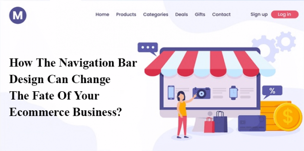
The navigation bar of a ecommerce website houses multiple answers inside it such as how to find x? Which product is in my size/colour? What all things i added to my cart? Etc.
A well designed and thought out navigation bar is the most essential aspect of ecommerce website. It helps in connecting the users journey in various aspects of the website beginning from search to shopping cart. This stands for one of the crucial feature of ecommerce website.
Why Navigation Bar Is Important And How It Can Attract Customers?
Navigation bar is the hub for all activities surrounded in the ecommerce website. From the beginning to the finish of the buying process. Developers from Ecommerce website development company in india, suggest that navigation bar is the one where customers instinctively get all the information right from the product to the shopping cart. All information in e-commerce websites are comforting but a poorly designed navigation bar can impede the customers journey causing them to bounce out of your website and seek the help of your competitor website.
There are majorly three function that navigation bar performs:
- If a customer is informed about what they want, then the work of navigation bar should be to make the customer reach the product without any delay.
- In case customer does not know what they are looking for yet the customers knows about the brand, the navigation bar should inspire and take the customers to somewhere where they can find the brand to make desired purchase.
- The navigation bar should also communicate what is the brand all about.
When a customers land on a website, the marketer has less than 10 seconds to impress them. These 10 seconds are meant to give the customers a complete information about various brands, what you are selling and what makes you different from your competitors. Now, the question is how customers can be encouraged to view further page?
This is where a well designed navigation bar can help. This will make customers take right purchase decision and understand the audience and the brand in a very short span of time.
Is There A Rule When Designing A Navigation Bar?
Developers from Website development company jaipur suggest that a well designed navigation bar should not have more than 7 options all together. Offering too many options in navigation bar make customer confused and they end being frustrated eventually leaving the website completely.
The second law of designing navigation bar is called “Hicks law”. Hicks law is the time customers use to make decision and this time increases with the increase in the number of alternatives. This law is broadly used for user experience because it makes complete sense.. The users may get more option, the more confused customers would become in choosing any single option.
Generally the initial and the end of the navigation bar options gets maximum clicks while the middle ones remains forgotten. This theory is supported by analytics and heat maps. It is important to think that structure of the site and occur from the first and last option on the nav bar is the place where customers feel the most connection. Therefore, it is important on the part of the marketer to use important piece of information at the start and end to generate adequate sale.
Is Adding Search In Navigation Bar Be Useful?
Search holds a very prominent role in giving satisfaction to customers. When search is added to navigation bar, it makes it easy for customers to get more information what the site is about and what all things are getting sold?. Customers can directly make them way to their desired product by simply typing the name of the product such as “ i want a green dress” or “ i need a red bag”.
This way customers will going to determine their own journey and a smart search function can get them to check out things much faster.
Is It Beneficial To Get The Brand Ethos Come Across The Navigation Bar?
There seems a real significance in appropriately naming the collections of your ecommerce website. For bigger brand playing around with names cannot confuse customers as they are aware of what should be expected but for startups and small companies, it is important to play safe. If you have a specific brand tone then prefer experimenting with it as it can help your brand stand out from the competition.
What All Things Should Be Completely Avoided In Navigation Bar Of Your Ecommerce Website?
The first thing to keep in mind is, never to put all your products under product category. This way you lose the opportunity to showcase customers what all things you can offer. If you navigation bar only have category like “about us”, “product”, “contact us” then you are not providing any idea or inspiration to the customers. This kind of approach will make customers go away as all the information seems to hidden.
The second important thing is aesthetics. There are at times we see “x” thing closes the browser window and links are underlined or a certain colour. These aspects should be well thought during the design process so that the aesthetics of the website does not get destroyed. If your font is underlined, or in a certain colour, users may get frustrated as they may find it as link but when clicked, they reach nowhere. Therefore, for a better user journey consider giving eye to aesthetics.
Conclusion
A well designed navigation bar should include the logo or the homepage link, some type of search place, your cart and the primary collection. In case, there is a scope of space, you can consider adding delivery information which can be added by graphics or banners below the navigation bar.
The key to success is obviously testing, therefore, keep testing and use analytics to find what exactly attracts the attention of the customer and implement them.
