Mobile UI/UX : Important Things To Know

Table of Contents
2. What are the 5 Elements of Use Experience (UX)?
3. What is the User Interface (UI)?
4. Which are the Top UI Design Principles?
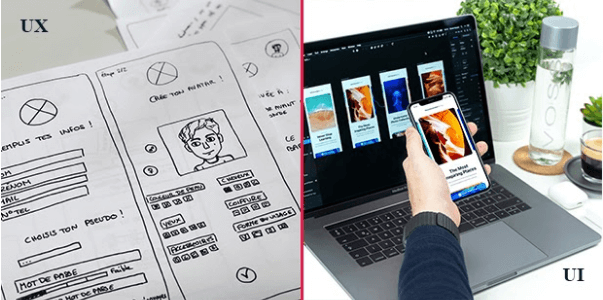
5. Difference between UX and UI
6. Benefits of investing in Mobile App UX Design
7. Top 10 Mobile Apps UI/UX Design Trends to Watch Out For in 2021
8. How to Monitor the ROI of your UX Activities?
10. Mind-Blowing UX Statistics You Should Know
1. What is User Experience?
User experience is all about how a user interacts with the company, the services which it offers as well as its products. Simplicity and elegance are the prerequisites to a marvelous user experience. Your products, whether a website, web application, or mobile application, should ensure a positive experience. In order to provide a meaningful and relevant user experience, the design of the product should be user-centric.
2. What are the 5 Elements of Use Experience (UX)?
1. Strategy
In this phase, business and user goals are ascertained by the experienced designer by conducting the following:
- ↪Stakeholder Interviews
- ↪Competitor Reviews
- ↪User Research
- ↪Existing Product Audit
Why is the product being created? How does the product fit the business strategy? Why do customers demand a product like this? What is the product expected to accomplish for the business?
The aforementioned questions are answered in this phase with the goal of defining the user needs and organizational objectives.
2. Scope
Defining the scope can help the organization to address all the potential conflicts before the time is actually invested in, designing and building the product. The scope defines two aspects: Functional Requirements and Content Requirements.
Functional Requirements: These requirements define the features and functionalities of the product, how the features will work and interrelate with each other. These features help achieve those defined user objectives.
Content Requirements: Without defining the content requirements, it won’t be possible to have a fair idea regarding the time required to complete the project. Text, images, videos, audio, and much more … all the information needs to be defined so as to render some value.
3. Structure
The key elements or components which define the structure of any product that is being designed are: Interaction Design and Information Architecture
Interaction Design: Abbreviated as IDX, interaction design, put in simple words, is the design of the interaction that takes place between the user and the product. When people talk about interaction design, the products generally referred to are the software products like a website or a mobile application. Interaction design is beyond those functionalities or physical aspects, it is all about how a user will interact with the product. It also defines how the system responds to the interactions made by the user.
Information Architecture: This component presents the information in an organized fashion thereby defining the arrangement and organization of content elements. It organizes and structures the content in an effective and sustainable manner so that the user can effortlessly adjust to the functionality of the product.
4. Skeleton
A well-designed UI assists the users to use the software product with much ease and without any help. A skeleton, therefore, helps to determine the visual form on the screen along with the proper presentation and placement of the different elements which in turn, helps the users to interact with the functionalities present on the interface.
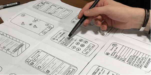
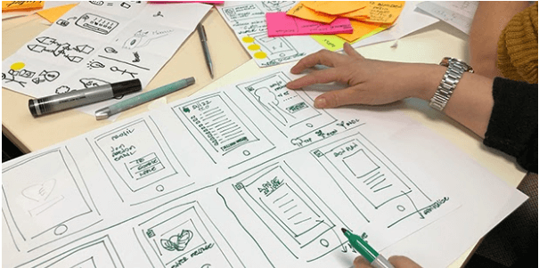
Wireframes are screen blueprints that are widely used to exhibit the interface and visual format of the product. They are a low-fidelity representation as they usually represent the most basic content, static visuals, and ways for interactions. A wireframe is an effective means to communicate the content, structure, and functionalities that will be present in the product.
Three components basically define a skeleton: Interface Design, Navigation Design, and Information Design.
Interface Design: It is nothing but a visual layout of the interface elements or functionalities that are going to be an integral part of the software product, with which the user will interact.
Navigation Design: It exhibits how the user can navigate or search the information, using the interface of the product.
Information Design: While defining the skeleton, it is important to know how the information will be presented to facilitate ease in understanding and information design does this job.
5. Surface
The final result of all the decisions, efforts and work that was put in, is what can be seen on the surface. It eventually determines what the product will look like and is all about deciding the right colors, layout, and typography, etc.
On the surface, it is all about the visual design (i.e. the sensory design) of the product with which the end-user will interact. This aspect deals with the visual appearance of all the controls, content, and how the user will ultimately interact with them.
To conclude, each element of the user experience is interdependent on the others. For instance, if you go wrong with the initial strategy, then you will screw up the entire project. A strategy is a foundation that should be carefully dealt with in order to have a user-friendly and successful UX. The strategy is what ultimately translates into the scope to define the functional and content requirements. Scope then decides the structure, which is all about deciding about the design of the interaction that the user will have with the product, the organization, and the presentation of the information. After deciding the structure, each of the screens of the product, all the interactions and functionalities are presented clearly while making the skeleton, with the help of wireframes. Finally, the surface provides the visual presentation of the product by summing up all the decisions taken and work accomplished.
3. What is the User Interface (UI)?
User Interface (UI) is the point of interaction between the computer and the human i.e. a means between the user and a website or application to interact. It is the visual part of a system or an operating system through which the user interacts to complete the tasks.
In order to design an excellent UI, it is important to follow the principle of “user is above all”. The product should be good enough so that the users can feel that they are effortlessly managing it, not the other way around.
4. Which are the Top UI Design Principles
“The user is above all” – No matter which product you design and develop, the user should be the priority. After all, it will be your user who will use and manage it! UI Design Principles are those high-level concepts that help to guide the software design. So, read ahead and find out the top principles that have to be taken into account to render a seamless experience to the user:
5. Difference between UI and UX
The two most often confused terms in the world of web design are UI and UX. They are often used interchangeably but actually very different. One reason why this happens is that the terms are often used together, for instance, UI/UX design.
To put it in simple words, UI is all about the visual elements of the solution or product, that assist the users in interacting with it. On the other hand, UX is all about the experience that the user gets while they interact with any product or service. While UI focuses on the surface and looks of the interface, UX is directed towards enhancing the user experience. UX is inclined towards solving the user’s problem and making the interface useful.
6. Benefits of investing in Mobile App UX Design
Expanding the business presence and enhancing the brand’s image is the ultimate goal of every business organization in order to make it more profitable. To accomplish this, today’s scenario calls for an investment in a robust and fully functional mobile application that can provide the business, a massive reach, and capability to make it big in the targeted market. But having a mobile application for business is not enough, it is important for businesses to take care of the user experience as well.
One thing that the most successful apps have in common is the marvelous user experience. A visually appealing and engaging app is the end result of businesses investing in an efficient UX and UI. To have a lasting impression on the user’s mind, designing the user experience that makes the app pleasant to use, is vital. So, let’s read in detail, the benefits of investing in mobile app UX design so that you can know your users well and design the product exactly the way they want:
a. Enhanced customer satisfaction and ROI – Positive emotional connection with an application is a prerequisite to enhanced user satisfaction. Catchy content, easy navigation, and simplicity are the key elements to improve the user experience and create what the users would love to interact with. Increased customer satisfaction will, in turn, lead to the growth of your user base and loyalty to your brand, thereby multiplying the usage of your mobile app solution. All this eventually leads to increased ROI for the business with loyal and returning buyers.
b. Reduced development costs – An effective UX strategy for a mobile application will enable your business to envisage any major issues that might occur during the app development. From designing those interactions for the users to the right placement of the elements, a UX strategy will help you strategically plan things in advance, thereby making things pretty much easier for the app designer. An effective UX design is the end result of comprehensive research of the user, information architecture design, creation of wireframes and prototypes, testing, and final implementation. Amongst these, prototyping and user testing have a substantial impact on the development costs because the more effective these steps are, the lower will be the development costs and the need for any redesign, thereby rendering a user-friendly application.
c. Helps businesses understand their audience – A successful app development starts with a thorough understanding and research of the needs and preferences of the end-users. The design should be user-centered and focused on the needs of the existing and potential customers. So, before designing the UI/UX of the app, a profound understanding of customer behavior and expectations helps in investing efforts towards improving the overall design and experience of the app. A better understanding of the audience, in turn, helps businesses to convert prospective customers into loyal ones and drive higher sales.
d. Helps build the brand – People love brands that empathize with them and solve their problems. They often love to come back to solutions or products that make them happy, so make sure that the UI/ UX takes care of how your user feels about the solution or product. In order to build a brand, which the user can instantly connect, it is vital that you make consistent improvements in your app and constantly enhance the features so that it can last longer. If your product is able to meet the expectations of the user, it is highly likely for your business to witness growth in the operations and brand name.
e. Enhances the simplicity of the application – By investing in the UI/UX, businesses can ensure that their app is simple and free of any clutter. By having a UX design in mind, you can easily deliver simplicity to your users through apps. UX makes sure that your application is easier to interact with and provides optimum results.
7. Top 10 Mobile Apps UI/UX Design Trends to Watch Out For in 2021
Are you really ready to embrace the design trends that will dominate the year 2021? With the end of 2019, it is time to look at the mobile app UI/UX trends for the year 2021 so that the apps you build are not just lovable but enticing too!
We all agree with one statement “The first impression is the last impression” and when it comes to mobile applications, the first impression is indeed the game-changer. The more engaging and visually appealing your application is, the more likely are the chances for users to connect with your brand in an instant. UI has undergone a sea change in the last few decades and the landscape of UX is transforming consistently, as well. So, it is pretty much of value to know as to which UI/UX trends are to go and will dominate the year 2021 and further. With changes coming in after the launch of 5G, many of these UI/UX trends will be dominated by them. So, scroll down and read the top 10 mobile apps UI/UX design trends that will skyrocket in the year 2021 and ahead:
a. Buttonless Design – We hardly encounter physical buttons on any mobile phone nowadays, in fact, physical buttons are no more present/used in modern phones. With the availability of more free screen space, the designers are able to render users with more information that is relevant to them. With gestures now being much more in use rather than those physical buttons, designers need to focus on buttonless navigation and take designs to a whole new level.
b. Improved Personalization – There is a renewed focus on personalization and in years to come, personalization will definitely gain more momentum. Machine learning and Artificial Intelligence (AI) are giving a greater push to personalization and making it pretty much seamless. Take an example of video streaming services like Youtube or Netflix where the AI assesses the users’ choices and offers continuous recommendations. So, it is quite important for the designers to design and render a personalized user experience that is unique and authentic too.
c. Rounded Corners – With modern flagship phones coming up with rounded corners, the designers have acquired a similar approach while designing the apps. The phones and apps that feature round corners make it easier for the users to process the information, which in turn, positively impacts the user experience (UX).
d. Password-less Experience – The world of mobile phones is rapidly moving towards passwordless logins as it is pretty daunting to remember so many passwords at the same time. Mobile phones have already started using facial or biometric recognition like fingerprints to make lives easier. Mobile applications like eBay use OTPs (One Time Passwords) and Medium sends special sign-in links to the user which can be used only once as there are no passwords.
e. Advanced Animations – Animations can prove to be very effective for enhancing the users’ experience from an app. With mobile devices becoming way more advanced and smarter, designers are able to produce advanced animations to provide a rich user experience. Animations effectively spice up things and have become an integral part of the branding strategy. With storytelling becoming the biggest thing ever, applications use movie-like scenes where the data gets changed from frame to frame, thereby making applications very engaging.
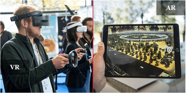
f. AR/VR – Augmented Reality and Virtual Reality have made it possible to incorporate the fictional digital components into real-world pictures or images by rendering the users an altogether revamped appearance from their everyday routine. Beauty, lifestyle, entertainment, media, science, real estate, education,eCommerce are a few of the several niches that are effectively using AR/VR in UI/UX of applications.
g. Designed for Speed – 5G has started to roll out across the globe, thereby requiring the application’s UI/UX to support that. Apart from the functionality, the speed of an application makes it popular. Therefore, slow applications will be considered as an example of a bad UX, thereby requiring the designers to design applications with minimalistic design and faster loading speed.
h. Dark Themes – Users love dark themes. Why? First, they reduce battery usage due to the restricted use of light pixels, and secondly, they reduce the eye strain for they adjust the screen brightness according to the current lighting. The new Android 10 and iOS 13 have the system-wide dark theme and they are indeed going to stay. So, designers should focus on this aspect in this year and time to come so as to make sure that the app’s UI is future-ready and up-to-date.
i. Full-Screen Flat Navigations – More and more people now access websites from their smartphones. With the increased use of smartphones with large screens, the navigation of the application has a dramatic impact on the user experience. Modern mobile devices can effortlessly manage more content and elements, thereby requiring the key objects to be placed in a simple list so that it becomes thumb-friendly.
j. Disabled-friendly Design – It is quite important to have an inclusive mindset and design a feasible product that can suit the needs of people with temporary, permanent and situational disabilities who often interact with the product differently. A screen reader for people with vision impairment can help to a great extent as they can hear the text and the interface elements when the text is read aloud. Acoustic signals, vibration feedback, gesture recognition technology, voice input, consistent navigation, transcripts, high contrast color combinations are a few of the many things that can help in accomplishing the approach of “accessibility-first”.
8. How to Monitor the ROI of your UX Activities?
ROI in UX
ROI is a financial term that basically measures or evaluates the efficiency of an investment. If you have invested a certain amount of money into something, then by calculating ROI, you can measure the gain or loss on the said amount of investment, expressed in terms of percentage.
ROI is a profitability formula and can be calculated as follows:
ROI = Return (Benefit) / Investment (Cost) * 100
While talking about any given design project, the investment is the money invested in the project or the time and the return could be enhanced user satisfaction, increased efficiency for the user, and reduction in the user error, all of which eventually lead to growth in the profits.
When it comes to User Experience, the concept seems to be immeasurable and subjective for the concept is all about intangibles like “ user satisfaction”, “delight” etc. But, the good news is, ROI in UX is not just measurable but also can be directly linked to the revenues or profits if measured in a correct manner.
Why calculate ROI for UX?
It is pretty much easy to dodge aside the UX as a trivial matter dealing with “experience” and “feel” from the product, but if not taken seriously, it will turn into a poor user experience and can prove to be more expensive than the good UX. Therefore, it makes absolute sense to invest in UX and dig deeper to calculate the ROI for UX. So, let’s dive in to find out why we need to calculate the economic outcome of our UX efforts in detail:
Reduction in long-term costs: The costs associated with solving your client’s problem after the launch of the product may seem to be insignificant but can prove to be pricey at a later point of time in the future. If you have thoroughly undertaken the market research, an understanding of your users’ needs and preferences and crafted accurate, data-driven customer journey maps, the users are going to encounter very few issues or problems. This, in turn, will reduce the time required to address the customer grievances over phone calls, emails, chat, or through support tickets. This might not seem to be a tremendous problem right now but running a redesign and redevelopment after the product has been launched and grown, would be very expensive.
Higher sales and conversions:
As per the British advertising tycoon, David Ogilvy, “If it doesn’t sell, it isn’t creative”. This thesis holds true not just for marketing but for user experience as well. Sales blocks and confusion during the buying journey can be destructive, so thorough research during the initial phase of design and following the best industry practices in design can eliminate these blocks. Therefore, better results can be achieved by investing in the UX of the product, resulting in higher sales and conversions. If at this stage, you notice a number of abandoned shopping carts or un-finished signups and consider them as significant business losses, it is high time you review the current state of your product’s UX.
Increased productivity: The human resource is often neglected the most in an organization. But, by investing in UX for your precious human resource, you can avail the benefit of saved working hours for all the employees. Besides this, enhanced productivity, greater efficiency, and employee retention are few other benefits that accrue from investing in UX for employees. An organization’s goal should be to make every minute of its personnel count and bring value to the business.
So, to calculate the worth of your investment in designing for the human resource and their productivity can be calculated by the below-given formula:
(Hours the activity that is avoidable takes place per week) * (Employee rate per hour) * (Number of employees undertaking the avoidable activity) = Production savings per week
Reduce the development time wastage: Fixing issues that relate to the user experience after the development is over can be pretty much expensive. Research has shown that almost 40-50 percent of the time of employees goes into avoidable rework rather than actual value addition. In a nutshell, if an issue pertaining to UX can be fixed for $1 during the design phase, the same can be dealt with during the development phase for $10 and $100 when the product is launched unsuccessfully without fixing the same.
So, the price of fixing UX issues can be calculated by the formula given below:
(Number of UX issues) * (Average time required in development for fixing issues) * (Developer’s average rate per hour) * (Number of Developers) = Price of fixing UX issues
Long-term user loyalty and retention sales: The cost of bringing new users or customers through paid advertising is becoming more and more expensive. That means the existing customers are having a value much higher than before.
The first thing that most organizations need to do is increase the average lifetime value i.e. LTV that any existing client usually brings. Therefore, the focus should be on the two key areas: Increasing the average conversion value and increasing retention. With these key areas in mind, a business can generate higher ROI during the A/B testing stage by building a productive UX customer journey map.
Key Performance Indicators (KPIs) to measure the ROI of User Experience (UX)
There are 3 metrics that quantify the ROI of your UX efforts and get directly affected by UX activities you undertake. So, let’s dive in and explore the most common KPIs to measure the ROI of UX :
a. Conversion Rate: The holy grail of all the sales targets is the conversion rate and the impact that UX has on your ROI can be measured by calculating this rate. For instance, if you wish to know how many people navigated to your blog and out of them, how many people subscribed to your newsletter (conversions), you need to calculate the conversion rate. Conversion rate is nothing but the proportion of the users that undertake the desired action like subscribing to a newsletter or channel or buy a product/service.
For example, if you have 1000 visitors daily on your blog and the desired action that you want them to take is subscribing to the newsletter. If 30 people subscribe to the newsletter, then the conversion rate will turn out to be 3%.
Conversion Rate = 30/1000*100 = 3%
Conversion Rate (%) = Subscriptions/ Potential Subscriptions *100
As a business owner, while calculating the conversion rate, you should evaluate if your current UX design is able to produce the required number of actions that you hoped for. If not, then you should consider making the desired changes in your UX design so as to enhance the conversion rate. You can spot the drop-off places and further redesign, test, and optimize the purchase flow to reach the targeted conversion rate.
b. Drop Off Rate: Drop off rate calculates the number of visitors that left the conversion funnel before conversion or completion of the desired action. Now you may wonder why it is important to calculate the drop-off rate? The reason is that after you calculate the drop-off rate, you can analyze the design as well as the usability of your conversion funnel to undertake the necessary improvements in your UX design for optimizing conversions.
But don’t confuse the terms drop-off rate and bounce rate as they are quite different. The bounce rate calculates the number of users that left immediately after seeing the first screen of the site and didn’t continue viewing further pages.
Drop-off rate helps the business owners to study in-depth the user experience as it shows a behavior map indicating the percentage of users leaving during each and every step of the conversion funnel. This helps to identify the main areas or causes of user dissatisfaction and confusion so as to improve the UX.
c. Single Usability Metric (SUM): While the analytics can provide you the necessary information about where and how many customers left your conversion funnel, it doesn’t tell you the problems or errors in your UX to help you improve it. In order to have a deep understanding of the problems or errors in the entire UX process, it is important that you have enough information about the same.
This metric measures the time spent by the user on completing the task, the success rate, satisfaction rate as well as error counts. This metric is summated and standardized in form, reflecting the overall usability score of your product. It is best used when you compare the different versions of your product or perform the A/B testing of the product.
Therefore as a business owner, you should spend some time analyzing your UX so that you can efficiently optimize your conversion funnel.
After all, few UX errors = fewer conversion drop-offs
To sum up, it is of paramount importance to make UX your priority if you wish to fetch a higher ROI from your UX efforts. Hiring a good UX designer or agency is not cheap, but the cost of poor UX is much higher. With a bad UX, you are creating points of friction for your user and their impression of your product is not going to be in any way good. So, good UX is definitely worth it!
9. UX Design Pricing
UI/UX Design Process Involves:
1. Research
2. Creating Wireframes
3. Prototyping
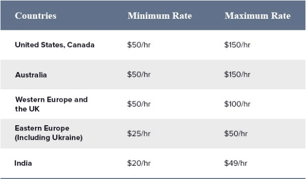
The average design rates by countries are as follows:
10. Mind-Blowing UX Statistics You Should Know
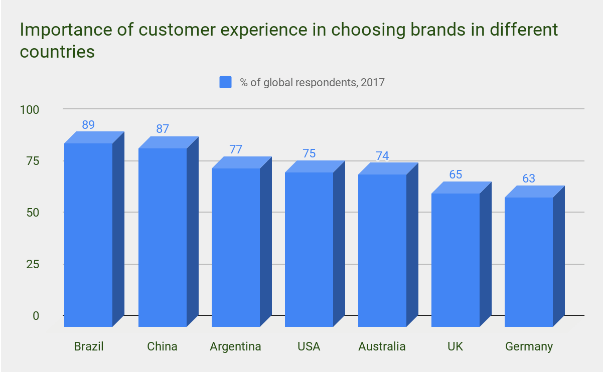
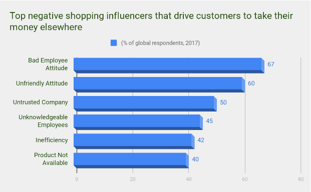
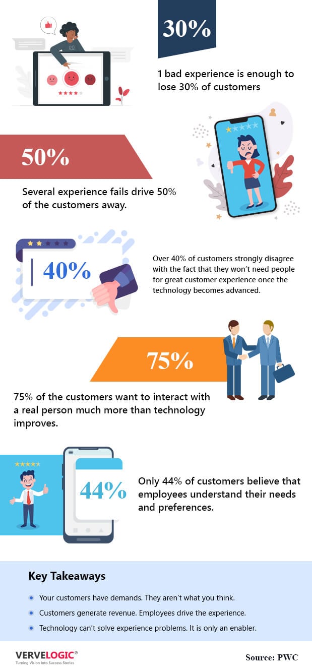
1. 73% (average across the world) of the consumers across the globe consider positive experience as the major driving force of customer loyalty.
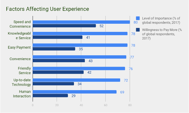
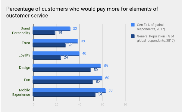
2. Customers are happy to pay more for an experience that goes past the standard and unites the top elements of people, technology, and service.
3. The major factor that drives customers away very fast is Bad Experience. There will not be many chances for the companies to get it right.
4. Younger generation values customer experience issues more, as per the report (Customer) Experience is everything: Here is how to get it right by PWC.
11. Mobile Applications with great UX
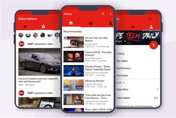
a. YouTube – One of the best and most popular videos streaming apps ever- Youtube has a very clean design and renders a marvelous experience to the users. It is fun to explore videos on YouTube as it is pretty much effortless to use the application. The Home Page has been designed to put a lot of emphasis on the recommendations based on the users’ search history and preferences, thereby helping users to build/adjust their playlist on the go. The overall Youtube experience has been designed to render enough space to the users so that they can personalize it according to their own preferences.
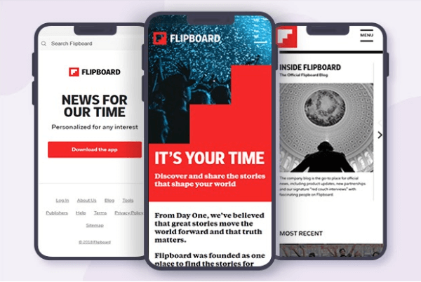
b. Flipboard – Flipboard is an excellent social newsfeed app with a beautiful design. This app rightly removes the chaos and curates digital media based on users’ interests, in-app behavior, and reading history. The amazing part- you don’t scroll the news feed, you swipe as the app displays a magazine-like format. You simply flip and read, it is very addictive! As you sign up, it asks about your passions and explores deeply about your interests. You can do a lot with Flipboard like adding flippable stories to your own magazine and other stuff apart from reading just the newsfeed!
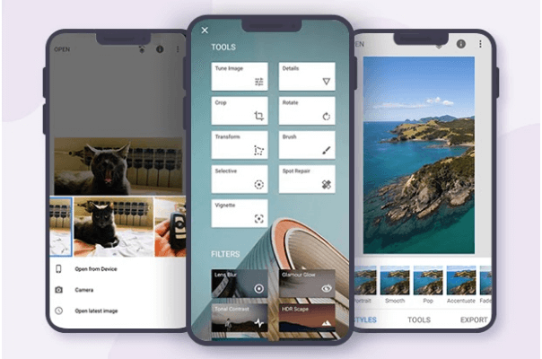
c. Snapseed – Snapseed is an interesting and professional photo editing application with extensive photo editing features. The best part about this photo editing app is the simplicity with which it delivers all the elements to the users. Using it is very simple and editing photos in this application is so damn effortless. The principal functionalities are present in the form of buttons at the bottom which clearly indicates that the designers of the app have taken care of the rule of thumb so that the users can perform all their tasks using just one hand and execute tasks with their thumb only. The app is quite intuitive and gestures make it a huge success indeed!
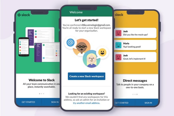
d. Slack – Slack is excellent and in fact the best team communication app with a very attractive color scheme. With millions of users worldwide, this workplace chat app acts as a single tool for messaging, tools and files. Slack has successfully combined an intuitive UI with both group chats and person-to-person chats (DM). The two fronts on which this application has done really well are design and understanding users’ needs. It is playful and pretty much fun to use!
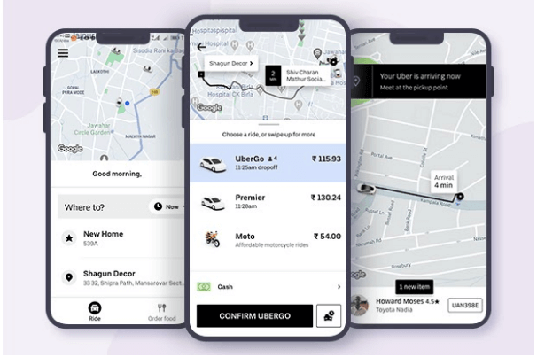
e. Uber – You can book a taxi at the drop of a hat with Uber. It is that simple! The rapid success of Uber is due to the simplicity of its UX. It prompts the user to enter the location and at the same time shows the list of recent places where the user had been to. As a user, you can conveniently track the current location of your driver and message them en-route. Changing destination, adding new destinations, providing feedback, and making payments is very simple with Uber. No matter your location, you can conveniently book a cab in just a few moments.
12. Best UX Blogs to Follow in 2021
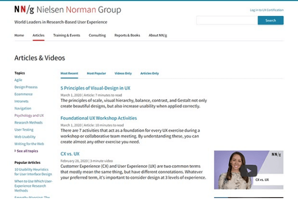
a. Neilsen Norman Group – This is the most trusted authority when it comes to usability. As a newbie in designing, you might find their blogs and resources, a bit difficult to read, but as you gain experience and practice in the field, you will find their content so much interesting and addictive. Their groundbreaking research, findings, and case studies will keep you hooked for long.
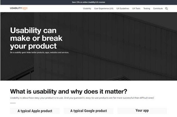
b. Usability Geek – You can get your hands-on practical and useful insights into topics like UX, Usability, Information Architecture (IA), Human-Computer Interaction (HCI), and other related fields by subscribing to one of the best blogs in the UX industry – Usability Geeks. The website renders practical advice on the aforementioned topics, so don’t forget to subscribe and add them to your reading list.
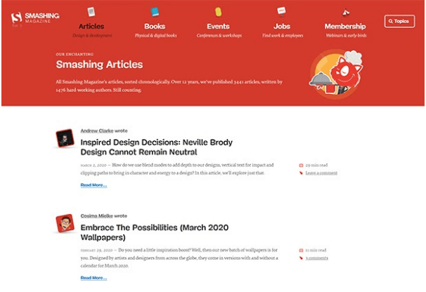
c. Smashing Magazine UX – For some great stuff on UX, a must add to your list should be Smashing Magazine. Their Smashing Magazine UX section is highly recommended for everyone, even for those most experienced UX pros. The articles are written by top-tier designers from across the globe, thereby making them an excellent resource to learn a lot of cool stuff. Practical tips, useful guidelines, great case studies, and recommended best practices of design – you can get everything here!
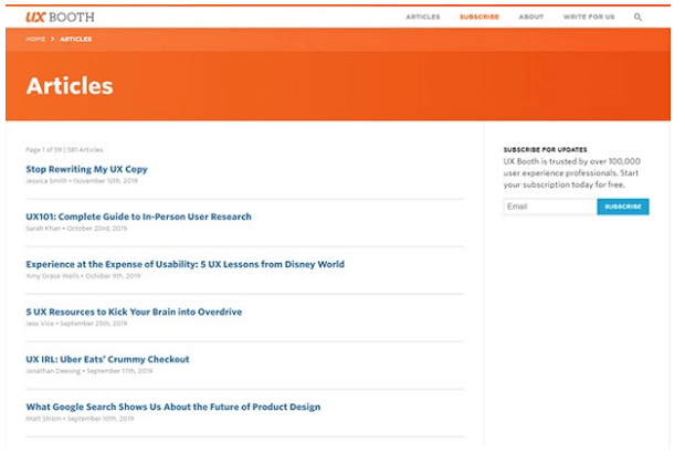
d. UX Booth – One of the most well-known and sought-after UX blogs online is UX Booth. The blog is a great resource for the user experience community especially the beginner-to-intermediate user experience and interaction designers. Their content is easy to understand and backed by thorough research. They focus largely on user experience design and you can find trending topics on their blog about interaction design, accessibility, visual design and much more.
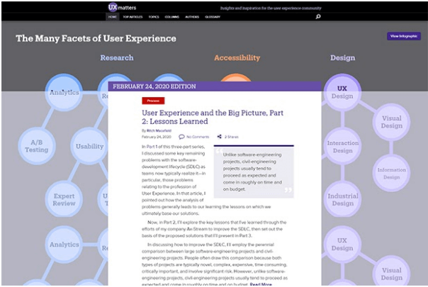
e. UXmatters – For insights and inspiration in user experience, UXmatters has plenty of resources to indulge in. Not typically designed as a blog, here you will find a wide range of great informative articles categorized into different topics. With plenty of case studies and opinion pieces, you will find even their oldest pieces still holding good. So, start your day with a cup of coffee and their posts!










I like the way you explain the importance of UI/UX in mobile applications. As most of the IT services companies offer UI/UX design.
Looking forward to more informative blogs like this.
User experience is all about how a user interacts with the company, the services which it offers as well as its products.——